spsComps
SPS Components package
systemPipeShiny Components (spsComps) package is a collection of custom UI and server components that are used in SPS main framework. If you see a component in SPS but want to outside the SPS framework, like in your own Shiny apps, take a look at these components.
Demos
| Demo | type | source code |
|---|---|---|
| shiny{blk} | shinyapps.io | Github{blk} |
| Rmd | Rmarkdown rendered | Raw{blk} |
Installation
Read the developer tools main page, not repeating here.
Category
{spsComps} can be divided into two major categories: UI and server.
- UI: Shiny or HTML UI components, for example, a box, a gallery, a button, etc. With
these most of components, you do NOT need a server, so they are compatible with
R markdown documents. See the UI page and its source code how we use the
components in a Rmd doucment. However, some UI components has server side functions,
mostly like
updateXXXfunctions. Mainly these functions are used to update/change the UI based on user behaviors. It is totally okay to use the UI functions without the server functions (you will get static UI). - server: can only be run in the Shiny server. These functions are designed to make back-end progress easier, extensions of original shiny Server functions.
Functions reference manual
In documents, we only highlight some important functions. Please read the reference manuals for details of every function.
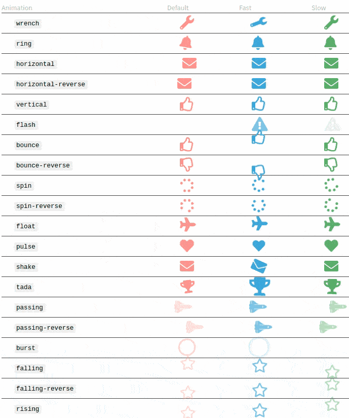
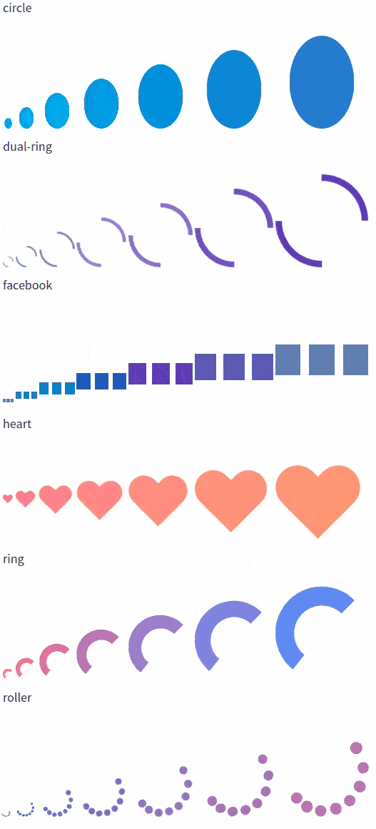
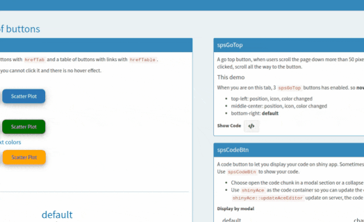
some screenshots of spsComps
Animations
Loaders
Buttons
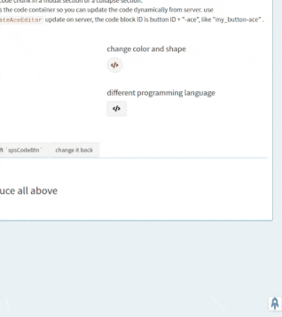
Code display button
Go top button
Input buttons

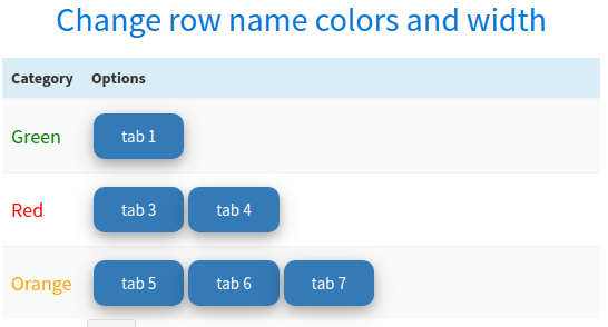
Button groups
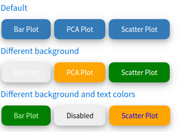
Table of buttons
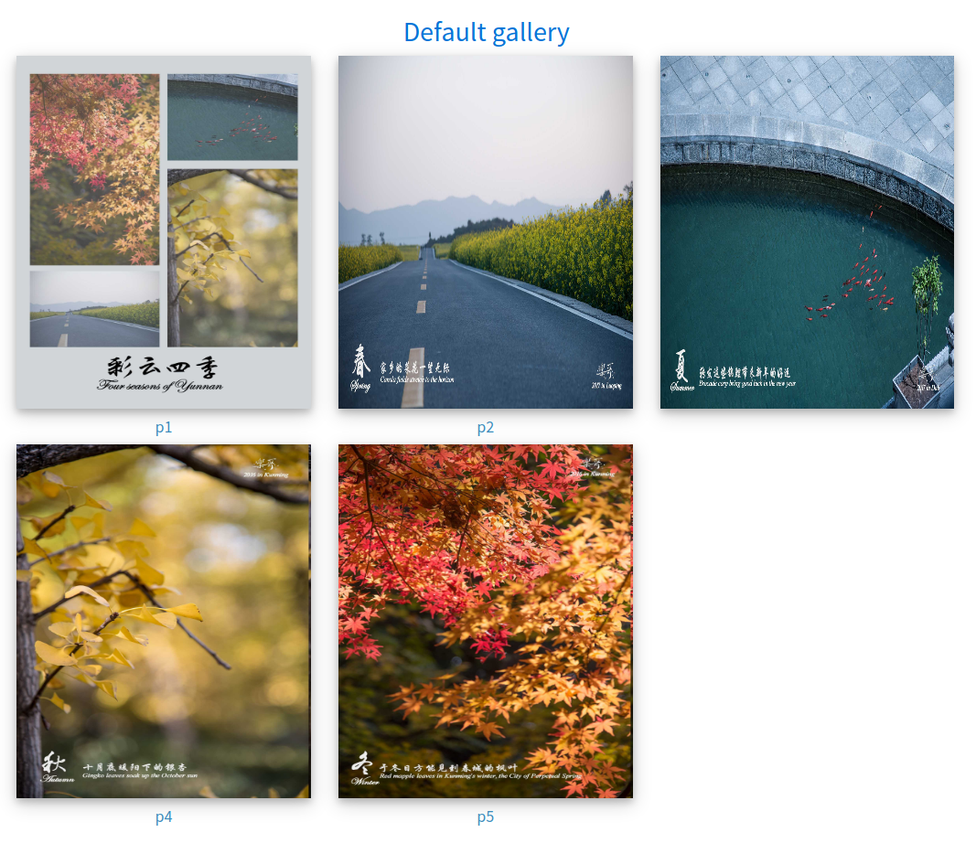
Gallery
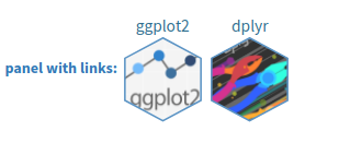
Logos
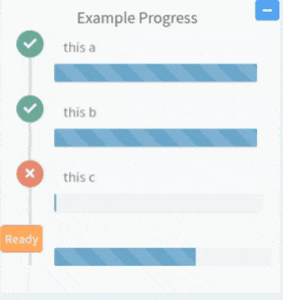
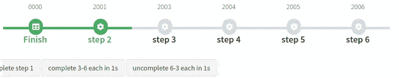
Progress tracking
Porgress panel
Timeline
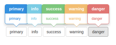
Tooltips
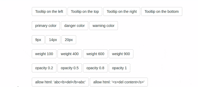
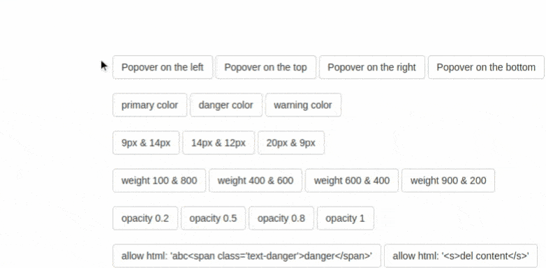
Popovers
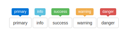
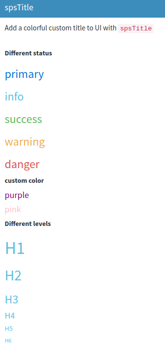
Colorful titles
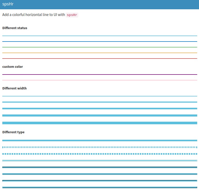
Colorful divider lines
Last modified
2021-05-17
: spscomps update no_render (29aa189e)